Team: Jake Sax (Me)
Year: 2021
My role: Creative Director, UX/UI Design
About The Project
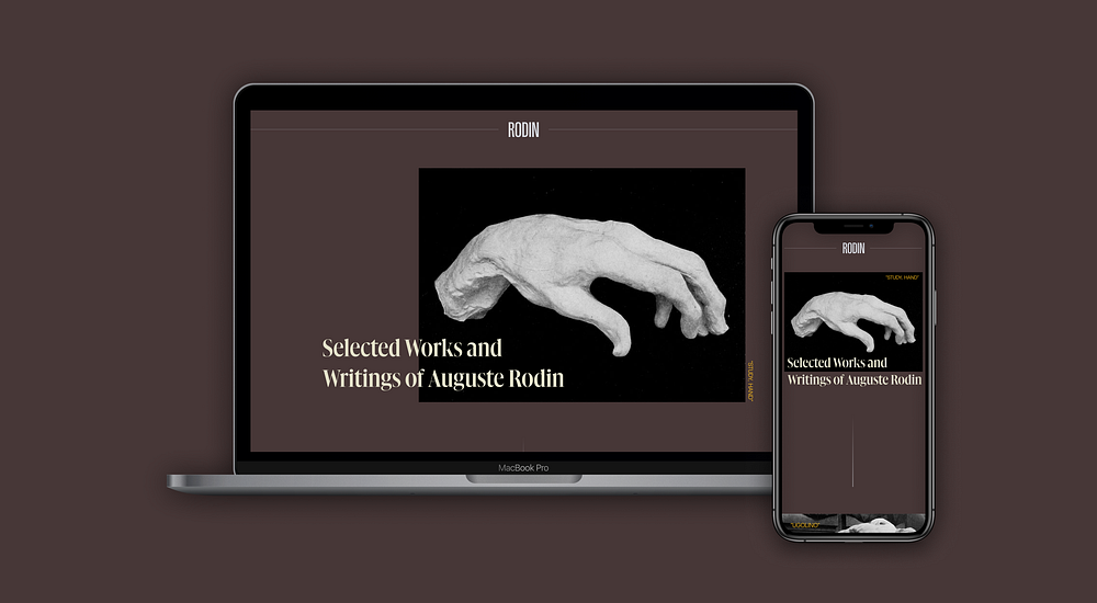
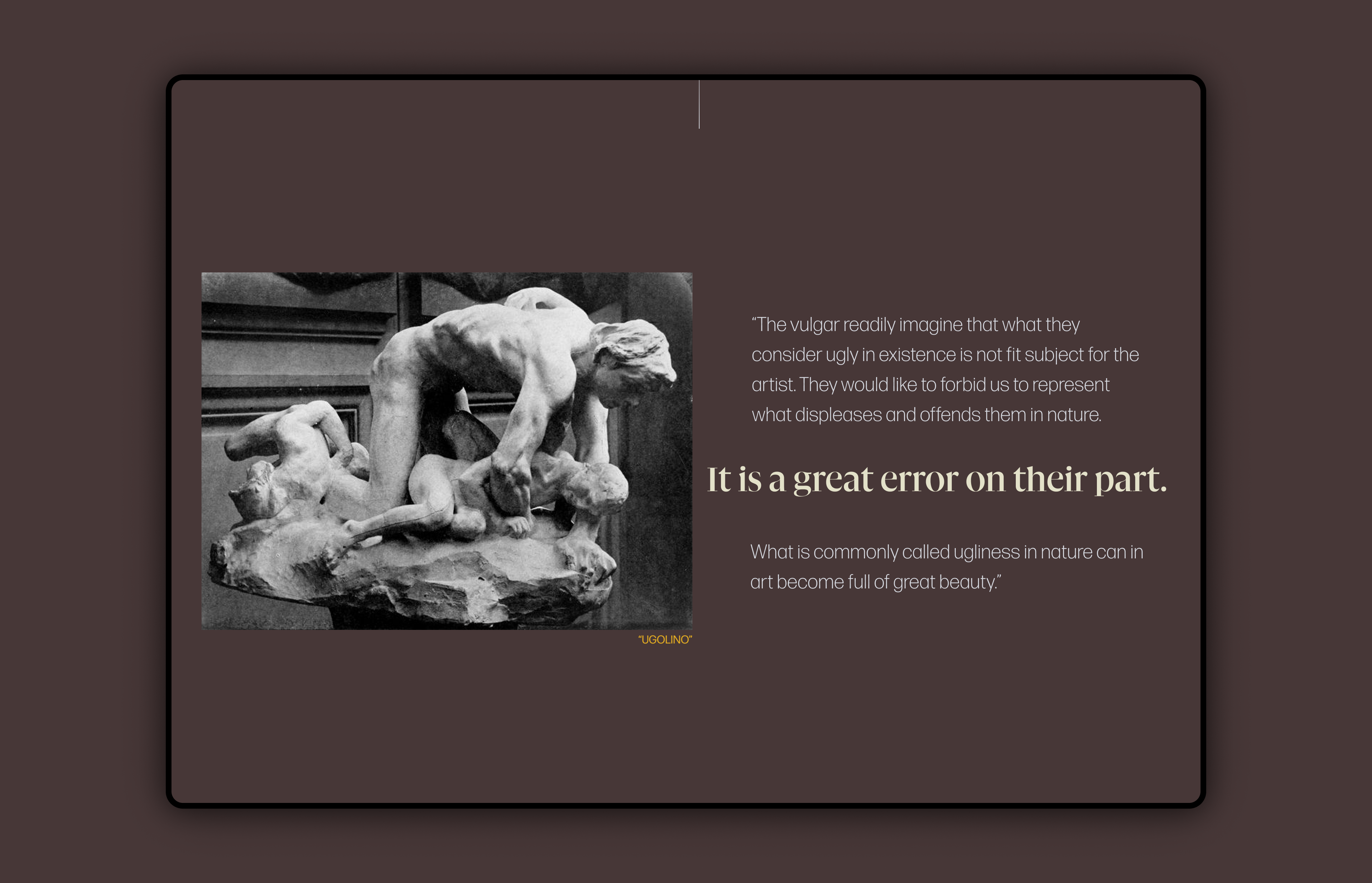
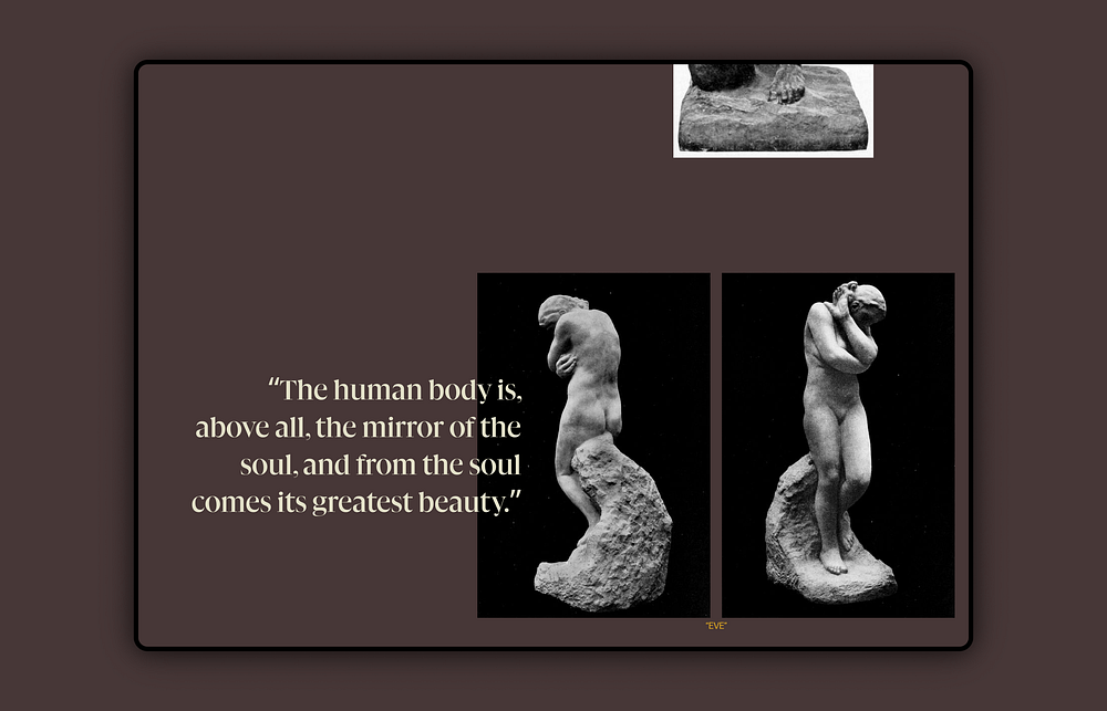
Rodin is a digital exhibition of select works and writings of the famous sculptor Auguste Rodin from his book Art. Its goal is to showcase some of his work and his thoughts surrounding it in a thought-provoking, quasi-narrative format.
This is a self-initiated project completed as the capstone for SuperHi’s Visual Design + Branding course. The prompt of this project was to take a printed publication of any kind and turn it into a digital experience. The idea was to take something that already had a solution and then adapt it to a new medium. We had around one week to complete the project, so this was a fast-paced challenge!
The Publication
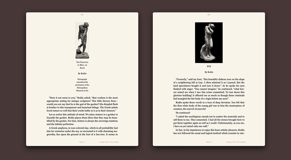
We were instructed to find a print publication, preferably a vintage one pre-90’s, to avoid copyright issues. Modern publications were more likely to already have a web presence, not to mention stricter copyrights.
I found this book of Auguste Rodin’s from 1912 in which Paul Gsell transcribes conversations the pair shared regarding art and sculpture. After beginning to scan the book to see if it interested me, I found myself engrossed by not only his tantalizing sculptures but also his way of writing (or speaking rather, as the book was dictated). At once, I decided to create a digital exhibition of selected pieces and quotes from the book that struck me as especially poignant. I originally intended to just scan the book, but as I found myself captivated, I ended up just reading it in its entirety.
Thinking Through User Flows
I decided to make this accessible as a website, both desktop and mobile, as an app would be exceedingly unnecessary. I wanted to create a simple, effortless experience so the user simply has to scroll down to navigate.

Visual Design
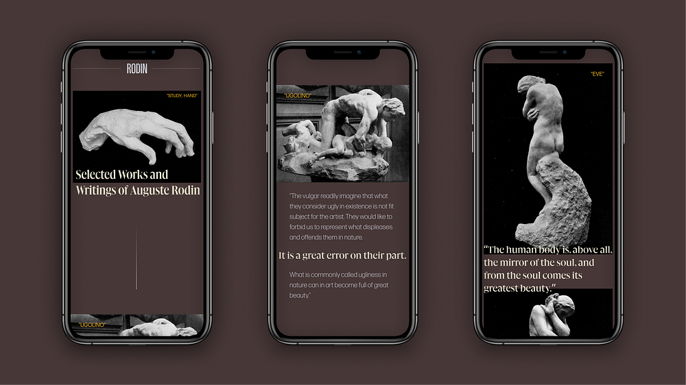
The color palette was designed to be serious and minimal. For the background color, I knew I was looking for something heavy but unobtrusive. I chose a desaturated maroon, a brooding, visceral color restrained enough to allow the art to be the focal point. I wanted something fairly unassuming that had sufficient contrast for my thin body text, so I chose a light gray with a slight touch of blue. As an accent color to emphasize certain quotes, I used a pale, creamy yellow — still quite subtle but with a bit more color to brighten it. The last color I chose was a bright goldenrod, slightly transparent to dim it a touch. I used this for the titles of Rodin’s work to draw the eye to the pieces first before they would read his musings.
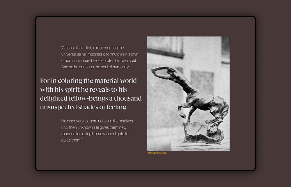
For the typography, I knew I wanted to use a couple of different fonts. I wanted one that was curving, elegant, and alive, a more decorative and ornate serif for headlines and highlighted quotes to echo the smooth curves of Rodin’s work. As a more subtle body font, I wanted something more subdued, yet very legible, airy, and unimposing. I settled on Gliko Modern for my serif typeface and Forma DJR Text for my body.
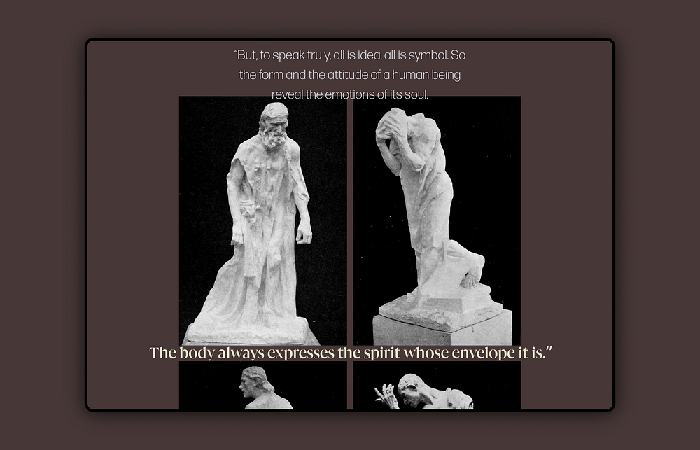
After finishing the book and saving all the photos and quotes, I began to formulate how I wanted to lay out the content in a way that reflected his vision and the animus behind his work. I decided on an asymmetrical layout to create tension and balance while allowing for irregular and inconsistent photo sizes. To maintain order amongst the asymmetry, I used a 10 column layout grid with a 24pt margin and a 20pt gutter for desktop, and for mobile, I used an 8 column layout grid with an 8pt margin and a 16pt gutter.
Challenges & Future Versions
The foremost challenge was completing this project within a short amount of time because each project of the course was allotted one week. Maintaining flow and balance with the asymmetrical layout of all the inconsistently sized images was the other challenge here, but with the equal and hefty amount of padding between elements, I felt it flowed well. Future versions could contain more information about each piece or more pieces, but I feel it is a good length and complexity as is.

